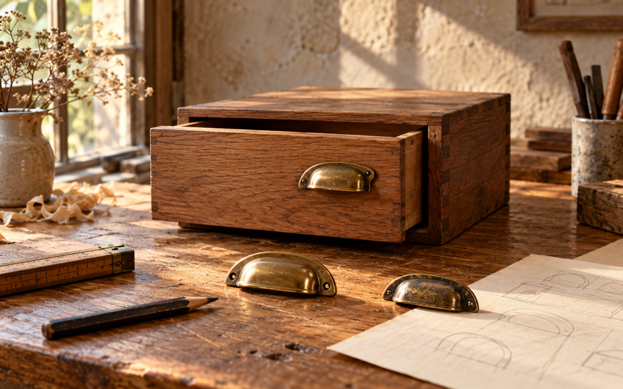
Some things look very impressive until you actually try to use them. Then comes that little pause. Do I push this? Pull it? Is this even the right door?
A design can look expensive and still leave you standing there feeling slightly foolish. We have imagined a few everyday situations where the idea needs another look.
1. A grand entrance with a small question
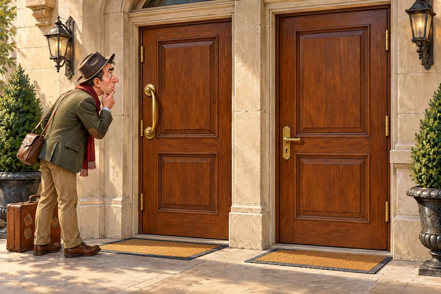
The doorway looks lovely. The handles look important. Our imaginary visitor still looks as though he would appreciate one clear clue about what happens next.
That is the funny part of everyday design. The object might be obvious to the person who made it and completely unclear to someone meeting it for the first time.
2. A sign that needs its own explanation
Imagine a sign saying the entrance is behind you, next to another sign pointing forward. Both could be neatly printed. Both could be perfectly straight. You are still going to walk in a circle.
The mistake is not the colour or the font. It is that the two instructions do not agree.
3. One button, too many possibilities
Now picture a machine with a single blank button. Will it start, stop, reset or call someone? Pressing it becomes a tiny adventure that nobody asked for.
These are fictional examples, but the frustration is familiar. A useful design tells you what to do before you have to think too hard about it.
Sometimes the cleverest improvement is a very ordinary label. No dramatic makeover required. Which everyday object makes you stop and wonder what its designer was thinking?